- Load the R package we will use.
2. Quiz questions Replace all the ???s. These are answers on your moodle quiz. Run all the individual code chunks to make sure the answers in this file correspond with your quiz answers
After you check all your code chunks run then you can knit it. It won’t knit until the ??? are replaced
The quiz assumes you have watched the videos had worked through the exercises in exercises_slides-1-49.Rmd
Pick one of your plots to save as your preview plot. Use the ggsave command at the end of the chunk of the plot that you want to preview.
##Modify slide 34
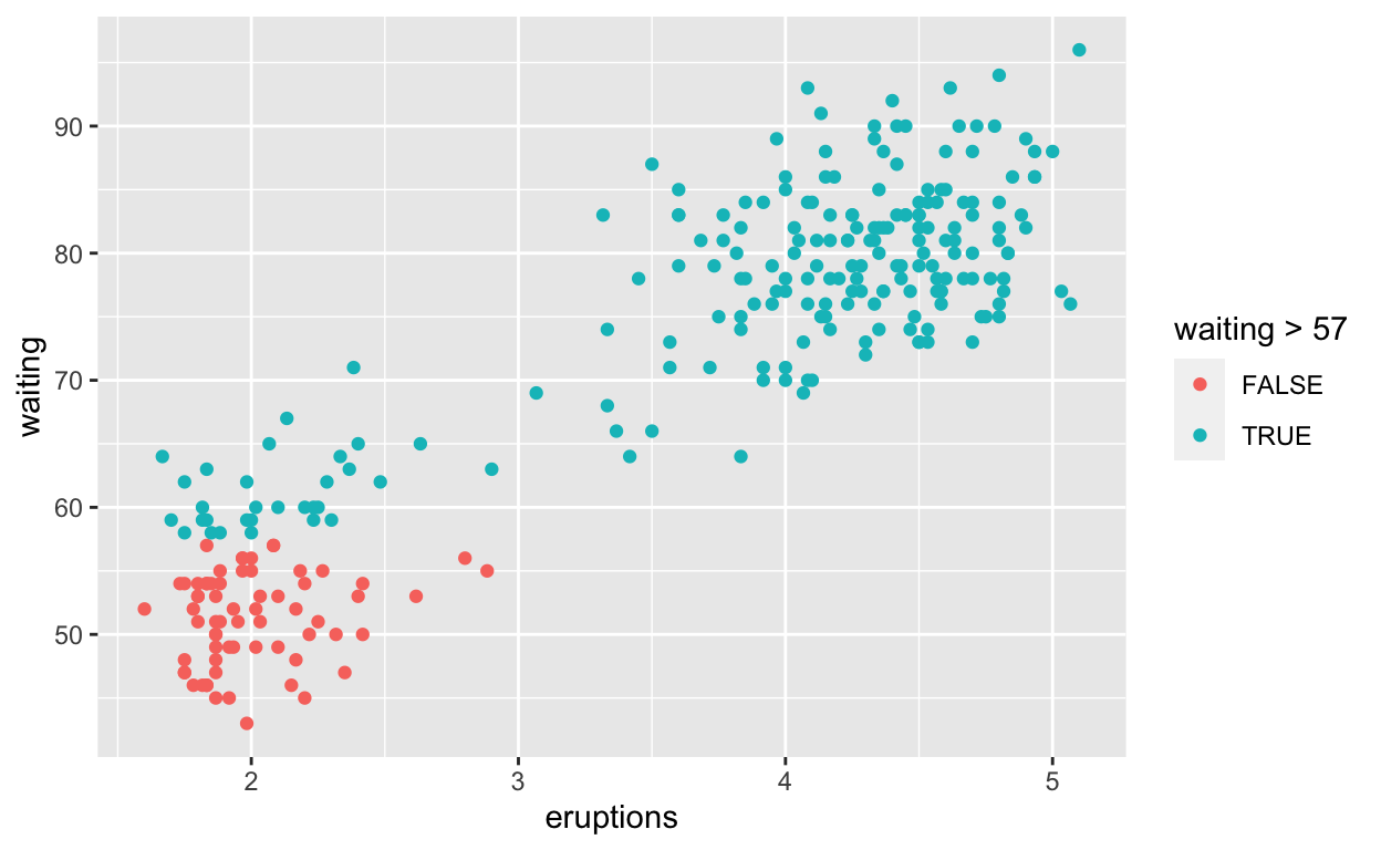
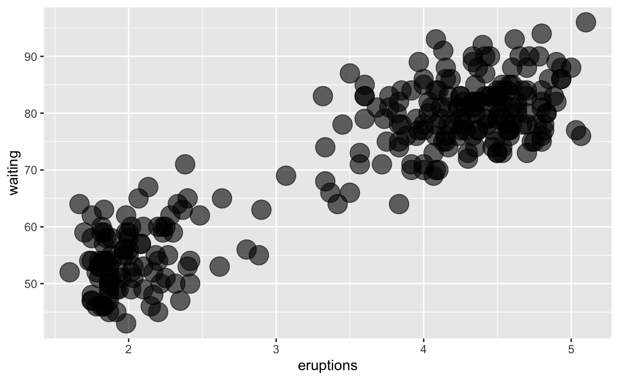
Create a plot with the
faithfuldatasetadd points with
geom_point* assign the variableeruptionsto the x-axis -assign the variablewaitingto the y-axiscolour the points according to whether
waitingis smaller or greater than 57.
ggplot(faithful) +
   geom_point(aes(x = eruptions, y = waiting,
                  colour = waiting > 57))
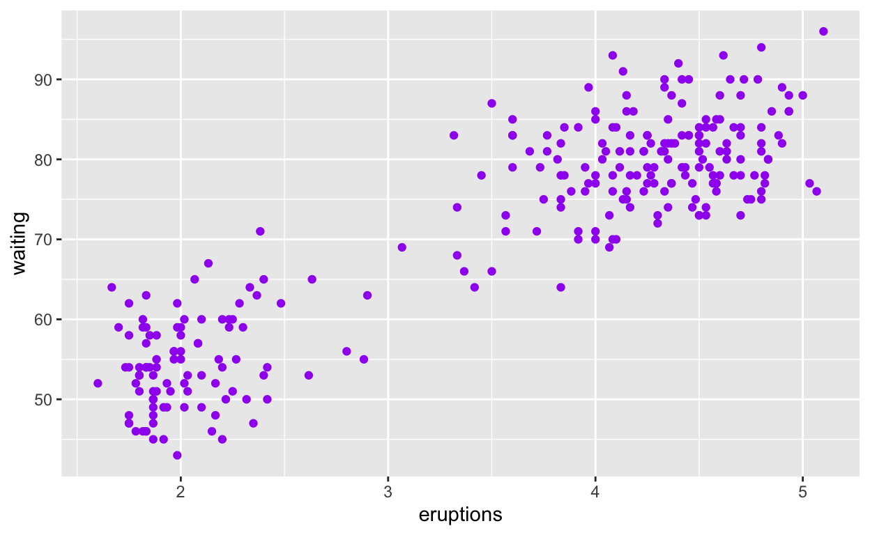
##Modify intro-slide 35
Create a plot with the
faithfuldatasetadd points with
geom_point-assign the variableeruptionsto the x-axisassign the variable
waitingto the y-axisassign the colour purple to all the points
ggplot(faithful) +
   geom_point(aes(x = eruptions, y = waiting),
              colour = "purple ")
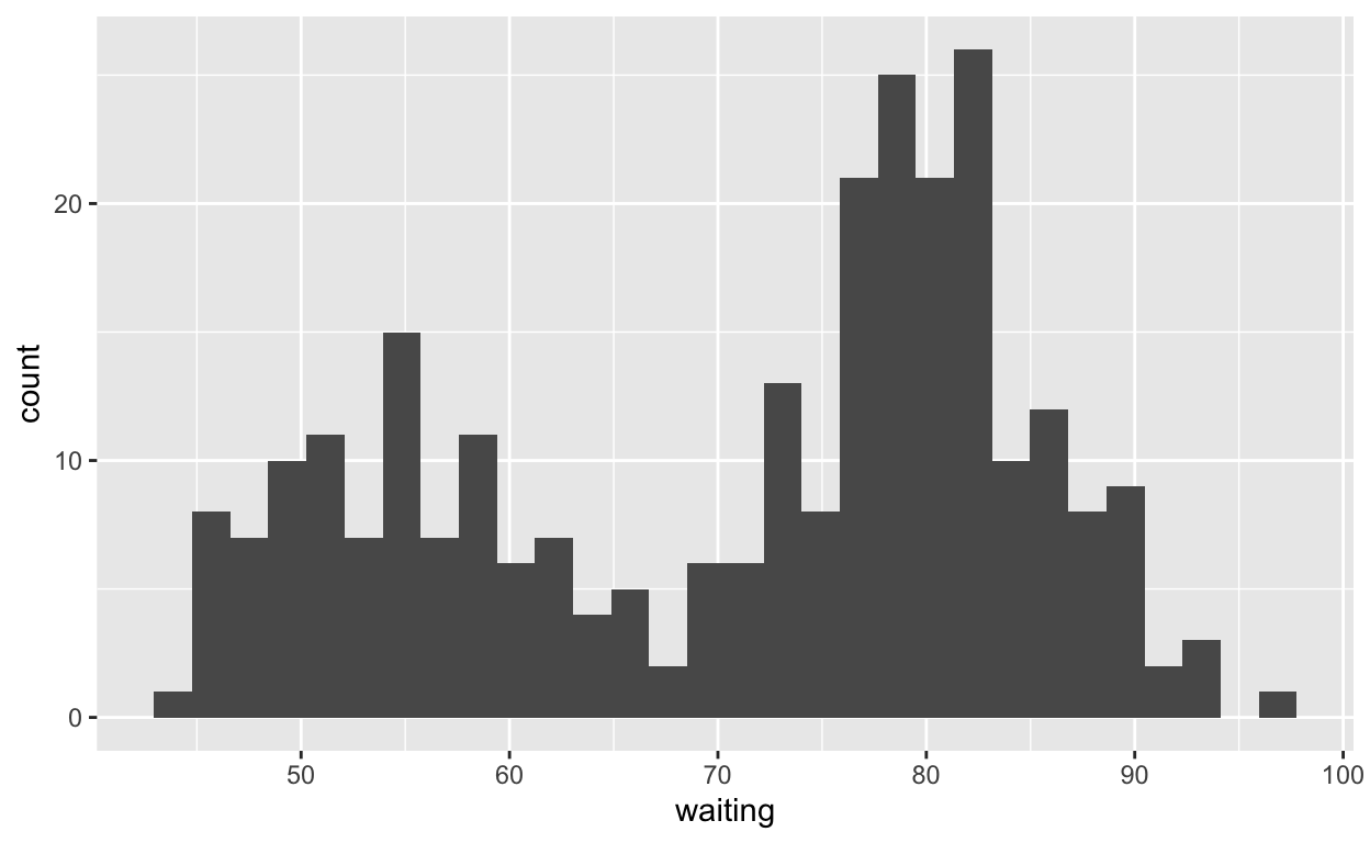
##Modify intro-slide 36
- Create a plot with the
faithfuldataset
- use
geom_histogram()to plot the distribution of waiting time
- assign the variable
waitingto the x-axis
ggplot(faithful) +
   geom_histogram(aes(x = waiting))
##Modify geom-ex-1
See how shapes and sizes of points can be specified here: [https://ggplot2.tidyverse.org/articles/ggplot2-specs.html#sec:shape-spec]
Create a plot with the
faithfuldatasetadd points with
geom_pointassign the variable
eruptionsto the x-axis assign the variablewaitingto the y-axis set the shape of the points to bullet - set the point size to 10set the point transparency 0.6
ggplot(faithful) +
   geom_point(aes(x = eruptions, y = waiting),
   shape = "bullet", size = 10, alpha =0.6)
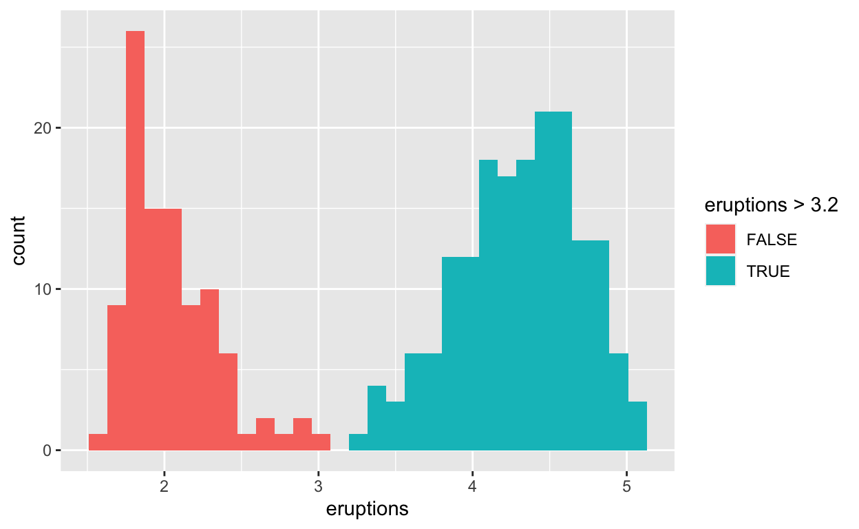
##Modify geom-ex-2
Create a plot with the
faithfuldatasetuse
geom_histogram()to plot the distribution of the eruptions (time)fill in the histogram based on whether
eruptionsare greater than or less than 3.2 minutes
ggplot(faithful) +
   geom_histogram(aes(x = eruptions, fill = eruptions > 3.2 ))
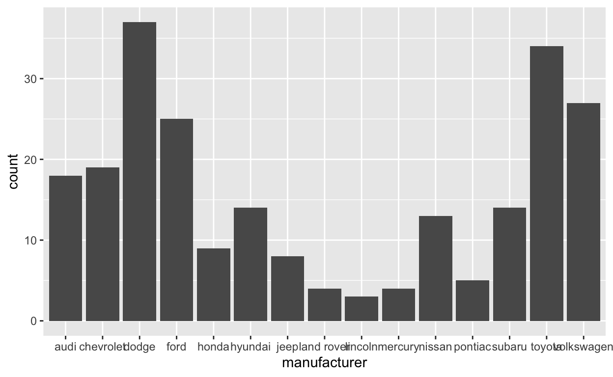
##Modify stat-slide-40
Create a plot with the
mpgdatasetadd
geom_bar()to create a bar chart of the variablemanufacturer
##Modify stat-slide-41
- change code to count and to plot the variable
manufacturerinstead ofclass
mpg_counted <- mpg %>%
  count(manufacturer, name = 'count')
ggplot(mpg_counted) +
  geom_bar(aes(x = manufacturer, y = count), stat = 'identity')

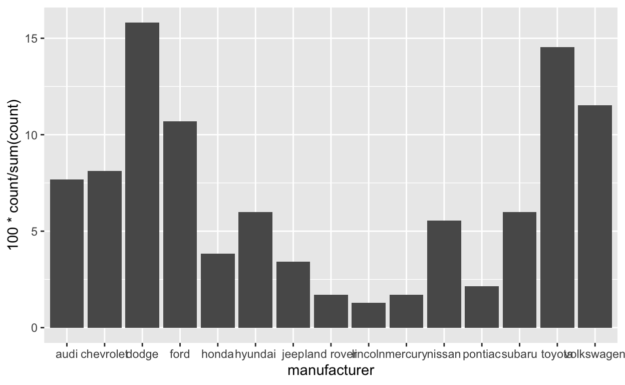
##Modify stat-slide-43
change code to plot bar chart of each manufacturer as a percent of total
change
classtomanufacturer
ggplot(mpg) +
  geom_bar(aes(x = manufacturer, y = after_stat(100 * count / sum(count))))
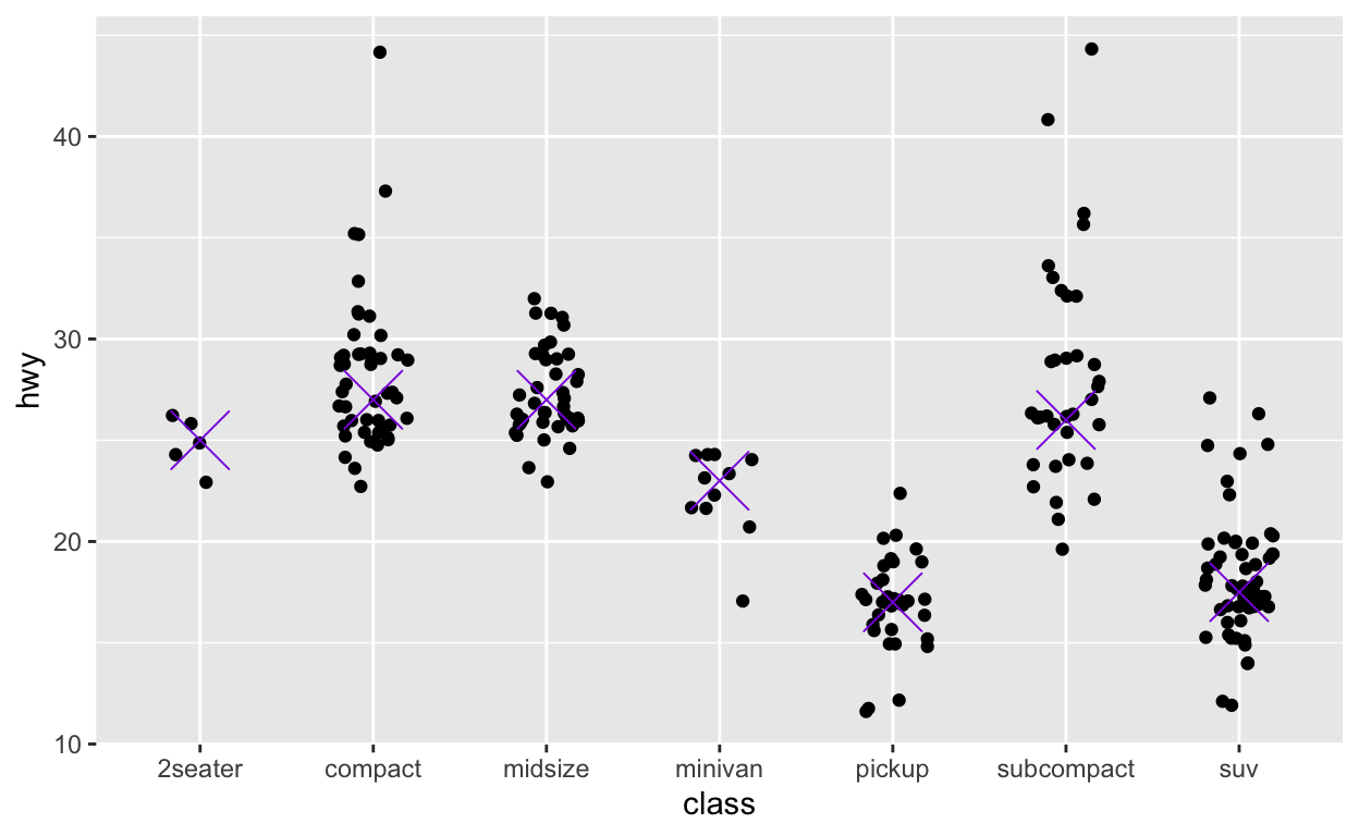
##Modify answer to stat-ex-2
for reference see: [https://ggplot2.tidyverse.org/reference/stat_summary.html?q=stat%20_%20summary#examples]
Use
stat_summary()to add a dot at themedianof each group color the dot bluevioletmake the shape of the dot cross
make the dot size 9
ggplot(mpg) +
  geom_jitter(aes(x = class, y = hwy), width = 0.2) +
  stat_summary(aes(x = class, y = hwy), geom = "point",
  fun = "median", color = "blueviolet",
  shape = "cross", size = 9)